Principal UX/UI Designer
Research, Usability testing, Design
6 months
The Solution
I designed a custom ticketing platform for museums and cultural venues that streamlines admissions, automates discounts, and simplifies financial tracking. Built for non-technical staff, it prioritizes speed, error reduction, and financial transparency.
The Problem & Approach
How might we design an intuitive, efficient, and cost-effective ticketing solution for venues that streamlines admissions, automates discounts, and simplifies financial management—while accommodating diverse user needs and reducing reliance on manual processes?
Goals:
• Prioritize speed & ease of use for non-technical front-desk staff
• Automate discounts & cash-flow tracking to reduce errors
• Balance stakeholder needs (staff, accountants, management)
Constraints:
• Tight timeline for a full platform build
• Diverse user needs: Each user group had unique workflows
• No design system: Had to build UI patterns from scratch
Research insights
To ensure my solution addressed real pain points,
I conducted:
• Competitive Audit:
• Existing ticketing platforms were too expensive, too complex, or required high technical expertise
• Stakeholder Interviews:
• Front-desk staff → Needed faster check-ins and automated discounts
• Accountants → Prioritized financial accuracy & exportable reports
• Management → Sought cost savings & operational efficiency
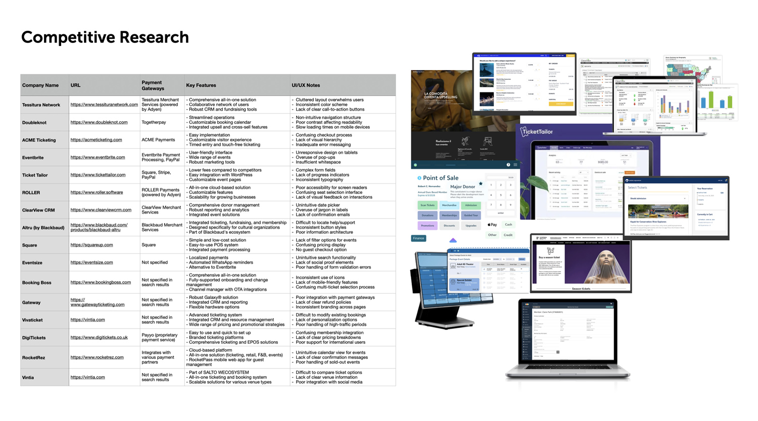
Key takeaway: A custom-built solution was necessary to meet user needs effectively.
The Process
Information Architecture
I mapped user flows to define navigation paths, decision points, and content hierarchy. This structured approach ensured a clear, intuitive experience and provided a strong foundation for wireframing.

Flowchart
Wireframing
I explored multiple layouts through low-fidelity wireframes, testing two navigation models:
1. Top navigation bar
2. Expandable sidebar
Stakeholder feedback helped refine workflows before moving to high-fidelity design.

Wireframes
Usability Testing & Iterations
Moderated usability testing on key workflows revealed critical insights:
• Sidebar navigation improved usability by reducing cognitive load
• Contrast adjustments enhanced accessibility
These refinements made the system more intuitive and efficient.
Throughout implementation, I partnered closely with developers — reviewing feasibility, refining the component library we built for the platform, and ensuring the final build matched the design intent.

Prototype iterations
Final Design & Key Takeaways
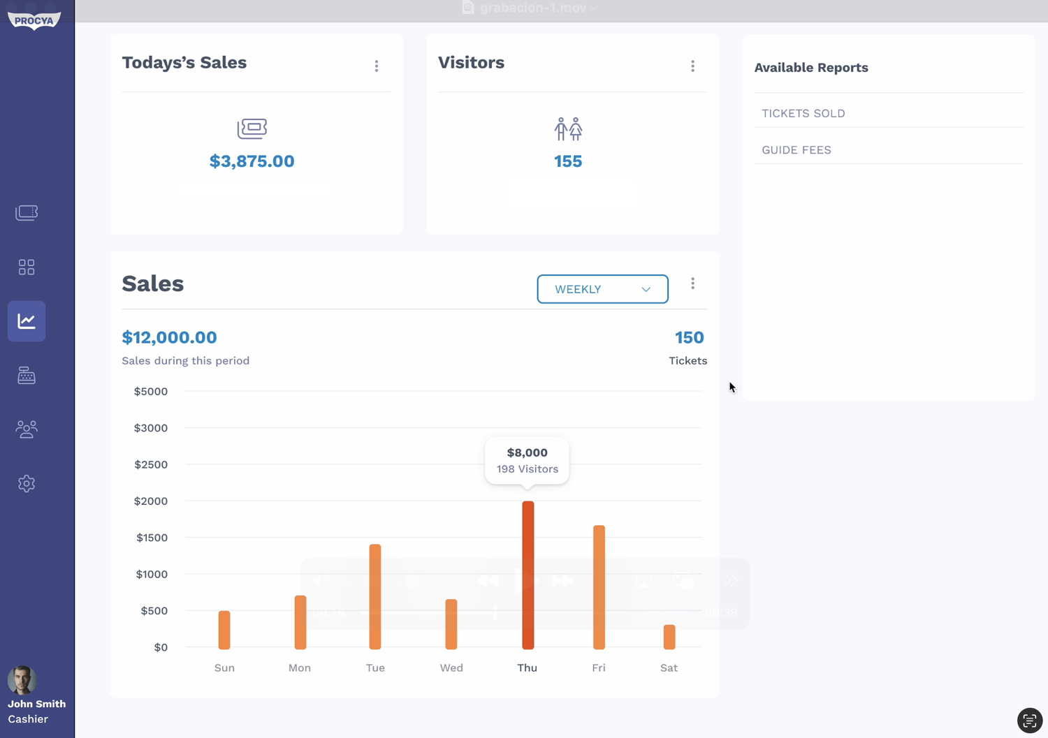
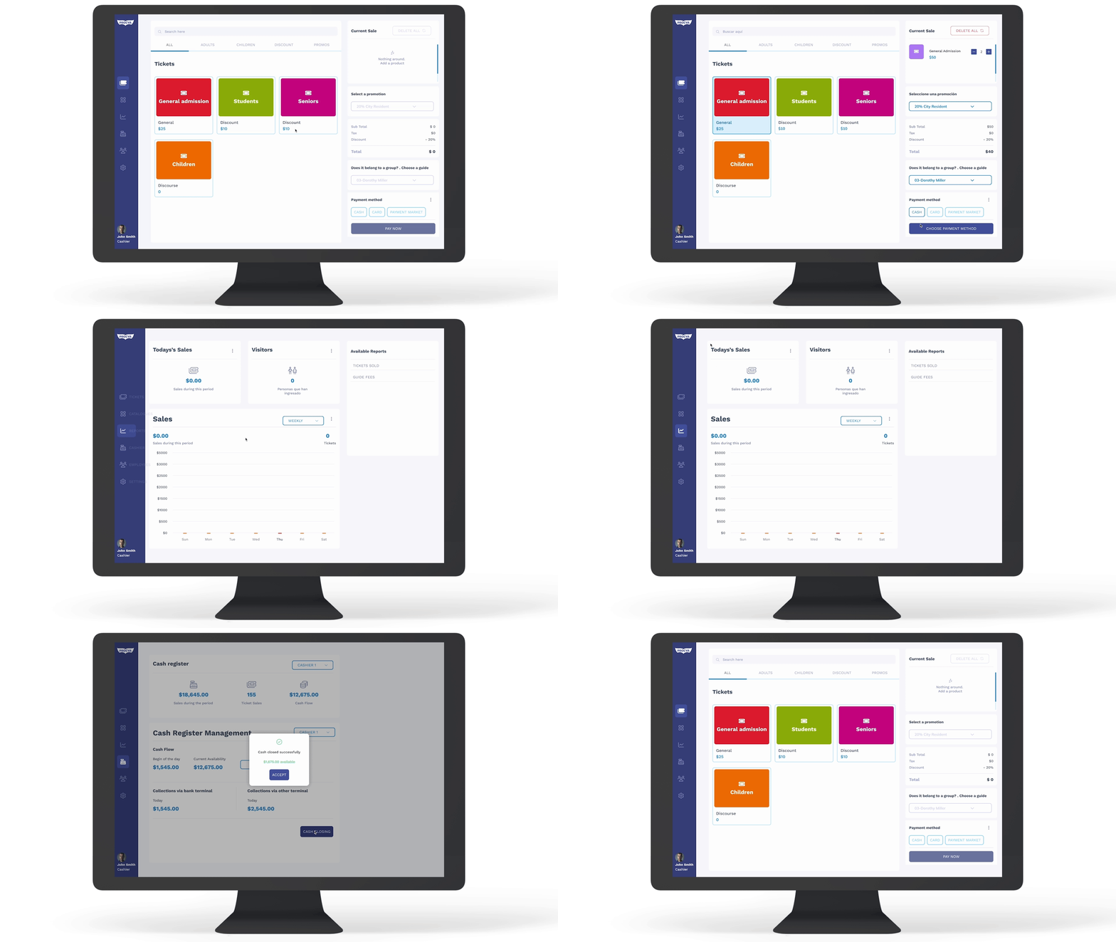
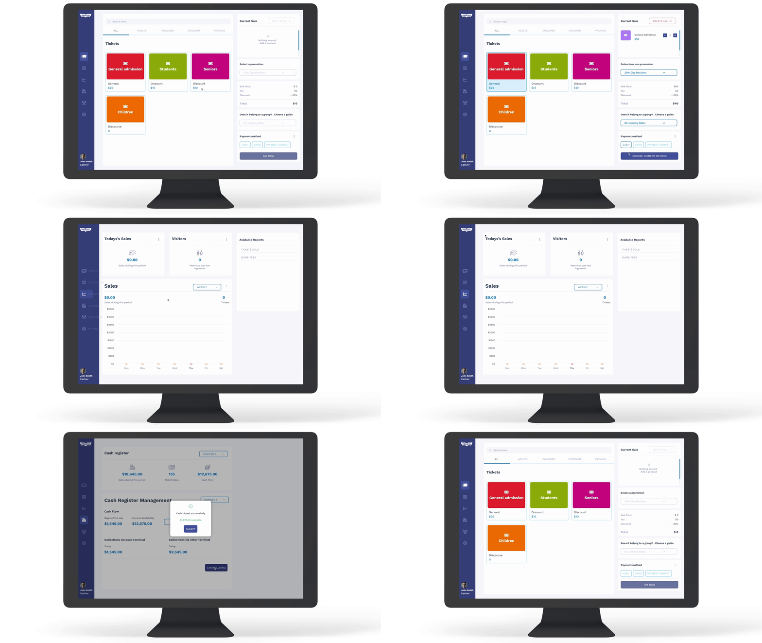
The final design delivers a seamless, efficient ticketing system that:
• Automates discounts and reduces manual errors
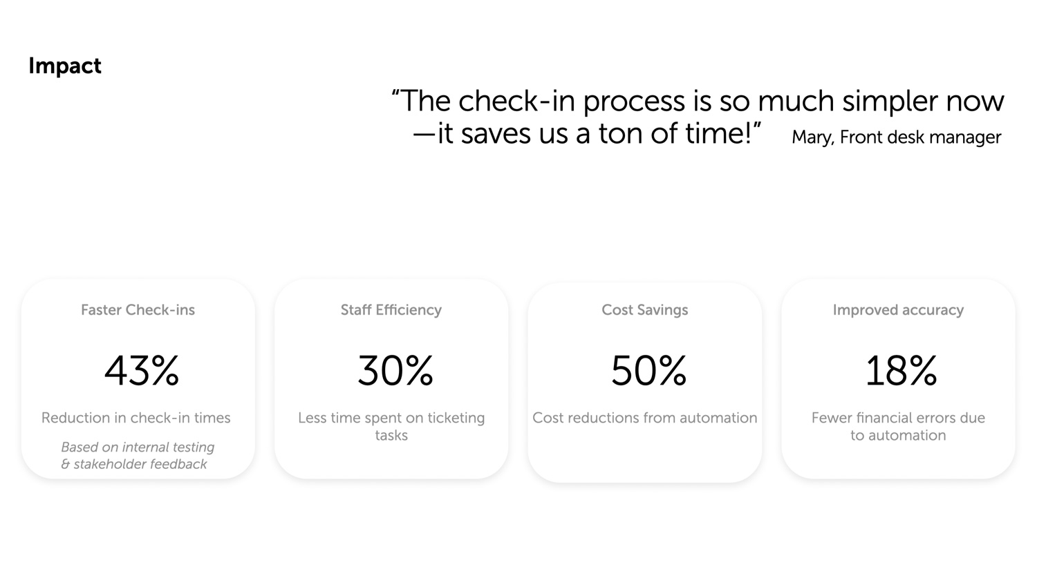
• Speeds up check-ins with an intuitive, optimized workflow
• Improves financial tracking with clear, exportable data
• Simplifies operations for non-technical staff
Key Learnings:
• Early usability testing helped refine navigation and accessibility
• Stakeholder collaboration ensured the design met real operational needs
• Rapid iteration in low-fidelity wireframes saved time and reduced rework